
Radar Widget
1 min read
The Radar Chart widget allows traders to analyze different series based on a specific set of criteria, which helps in visualizing how different tags or other statistical information perform when based upon PnL or any of the other options. The purpose of this chart to is to see if a specific series or filter, is approaching a specific value that you want it to approach, and compare different strategies side-by-side, to see if it’s doing what you expect, or having a negative impact.
Creating a Radar Chart #
To add the Radar Chart widget, simply click the plus sign on your journal dashboard, then click the Radar Chart icon:
A new Radar Chart will be created, that has three series filters attached.
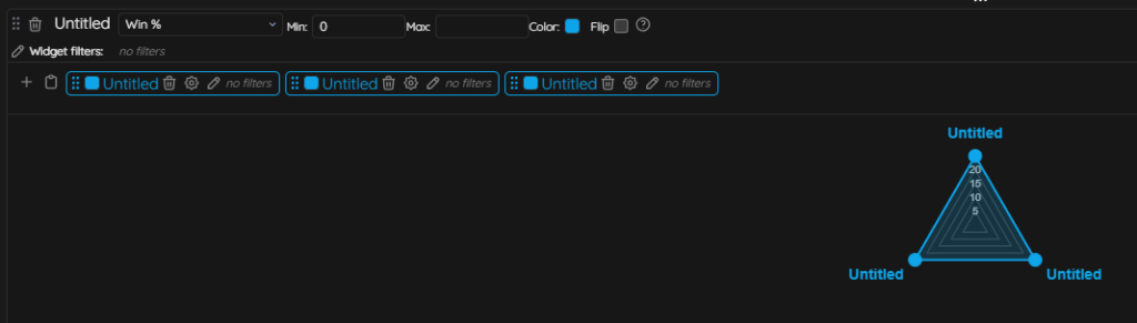
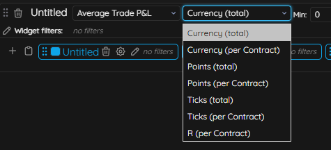
To adjust the criteria of how you view this data, you will use the dropdown next to the title of the widget (the default is Win %), but you can select any different options, then further break it down based on values such as Currency, R, Ticks, etc.
You can adjust the minimum and maximum values, which correspond with the middle (minimum) and top (maximum) of the chart itself, in relation to the series (filter) that’s being applied. If you remove the minimum and maximum values, then the chart will automatically adjust based on the series minimum and maximum values. You can use negative values for the minimum and maximum value, if the series filters support negative values (like scores). In the event that all the values of the series filter are negative, you can use the flip option to make them positive and flip the chart.